The Beauty of Scientific Papers: the Case of APSR
How has the design trends of scientific papers developed through the last 350 years? That was the question addressed by an interesting Paperpile blog post some years ago. The journals explored however were mainly from the natural sciences. Here we turn to the social sciences by looking at one of the best known political science journals among students and researchers alike: The American Political Science Review (APSR). The journal has been published continuously since 1906 covering various subfields throughout the discipline and is according to various metrics currently one of the highest ranked political science journals. Below are the first and latest designs of APSR papers and front pages presented along with the most significant redesigns in between.
Papers
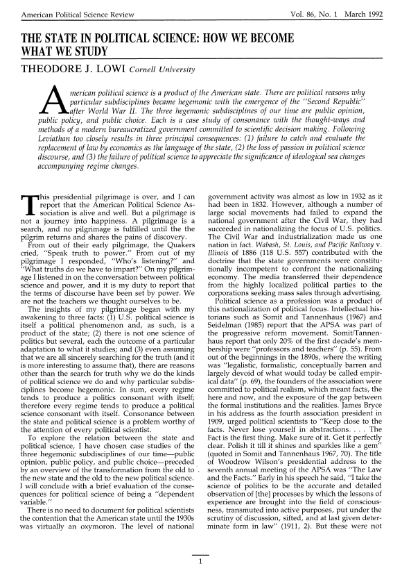
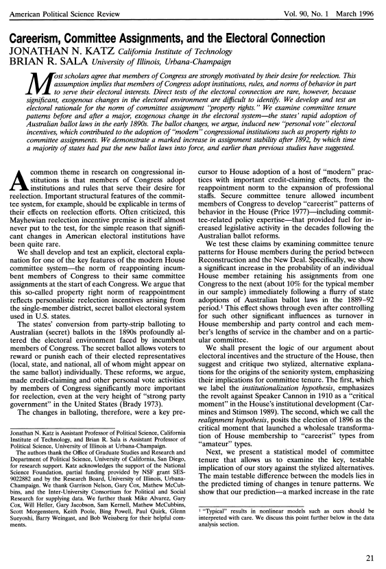
The first redesign of the journal came in 1960 with the change from a simple, one-column format to a more dense, two-column layout. The next came in 1978 when the abstract where introduced. As an interesting side note, all of the main journals explored in the Paperpile blog post, Phil. Trans., PNAS and Nature, introduced the abstract in the 1970s as well. Besides a very memorable type of heading the redesign of 1986 saw the first use of drop caps in the journal. The change of heading and typography in 1992 almost led to the current design of the APSR which came only four years later with an additional change in heading.
1906
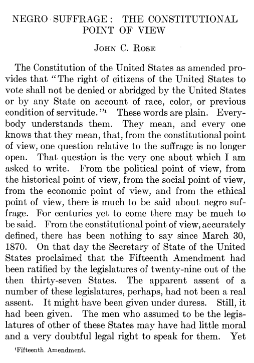
1960
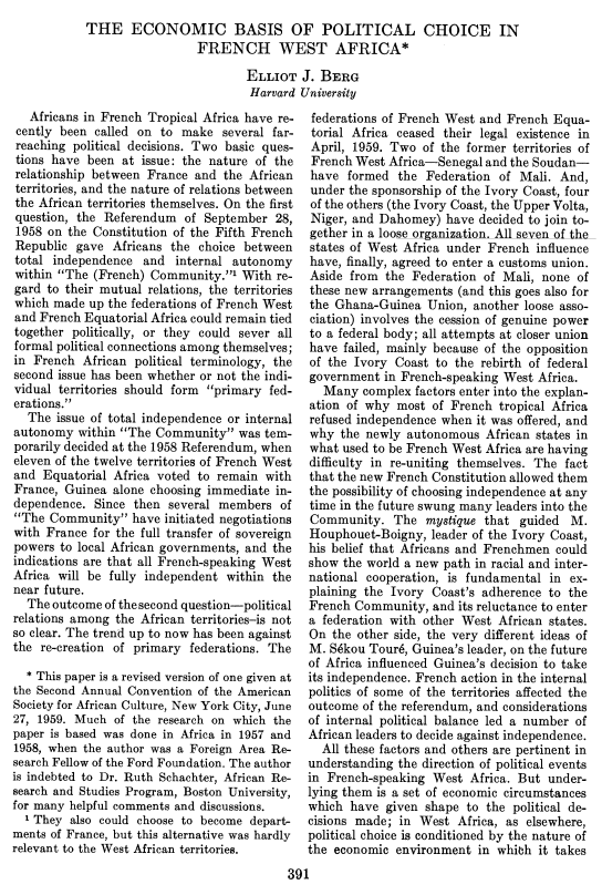
1978
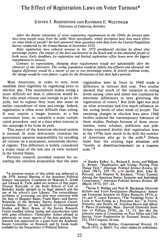
1986
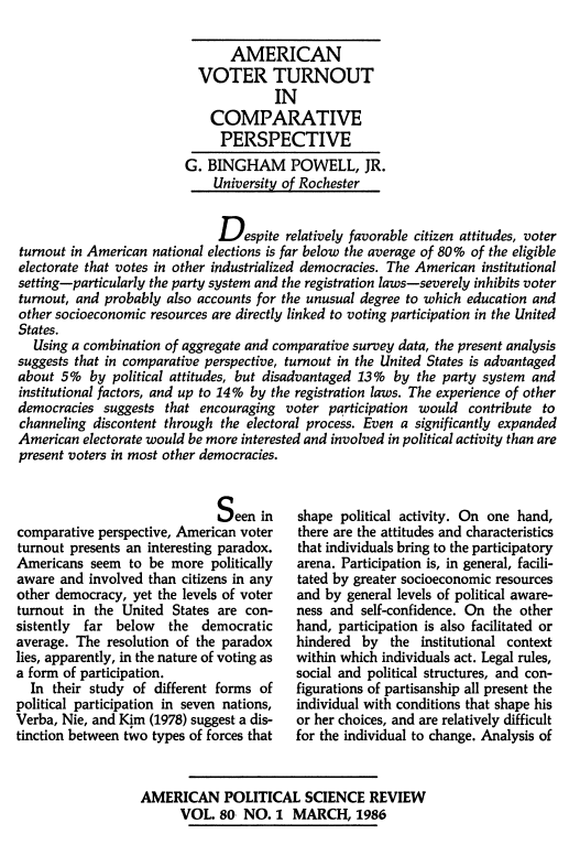
1992
1996
Front pages
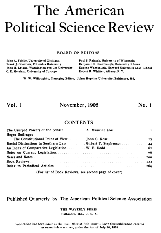
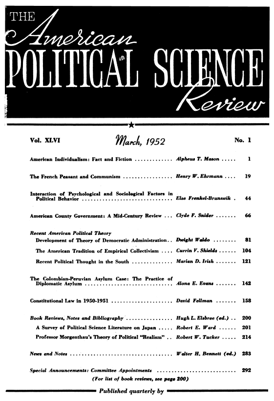
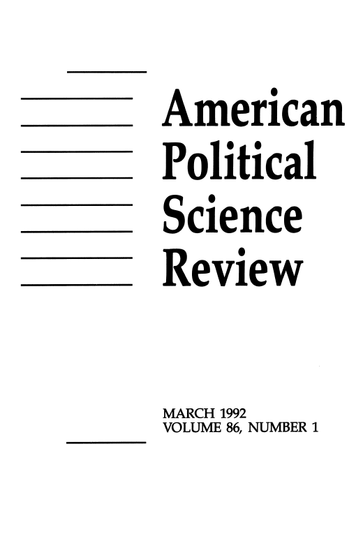
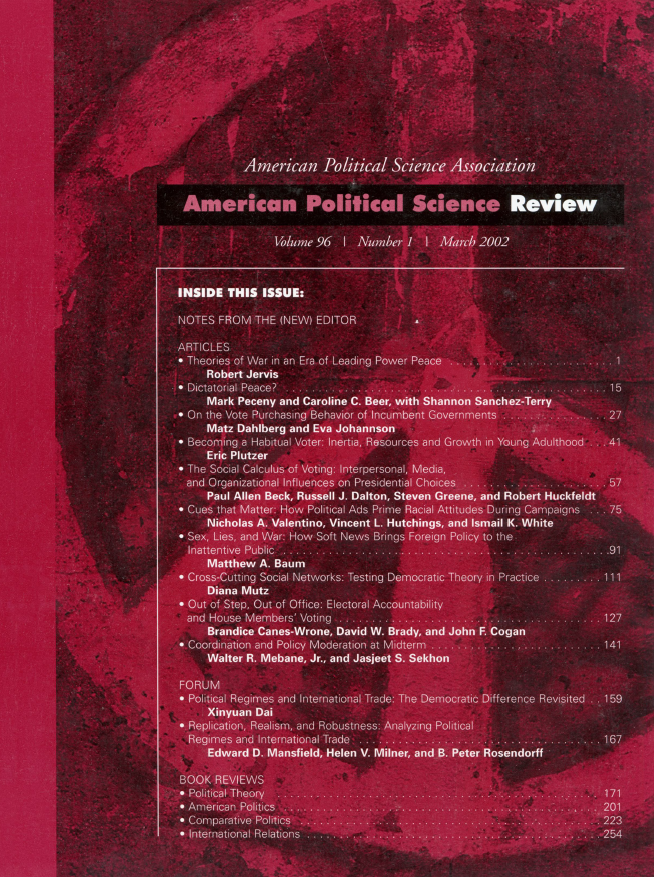
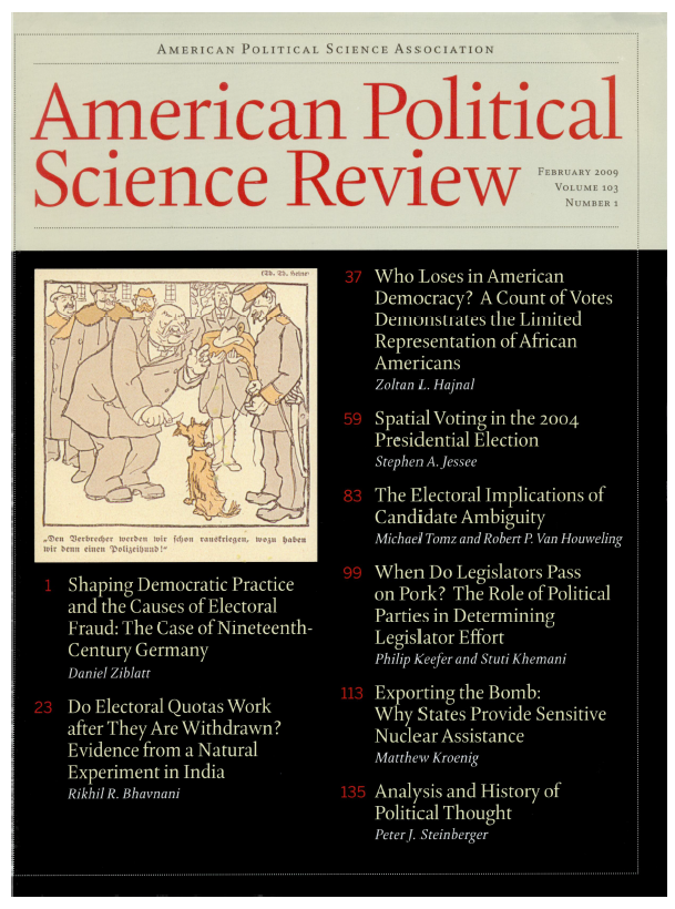
There has been a couple of more redesigns of the front page than of the papers in the journal’s history. In the first seven decades the table of contents appeared on the front page and the three redesigns in those decades primarily featured typography variations, mainly in the title. The first of those redesigns was the most noticeable with a classic 1950s style title. In 1978 the table of contents where removed from the front page which remained so to the beginning of the new millennium. The major redesign of 2002 saw the return of the table of contents along with the first front page in color. In 2009 a cover photo was introduced, keying into the theme of the first article of the issue. The current, plain design introduced in 2018 eliminated the table of contents, cover photo and the idea of having a lead article. According to the Notes from the the Editors from the the first issue of 2018 “[…] the cover of the APSR should reflect our scientific identity rather than one of a striking magazine.”
1906
1952
1966
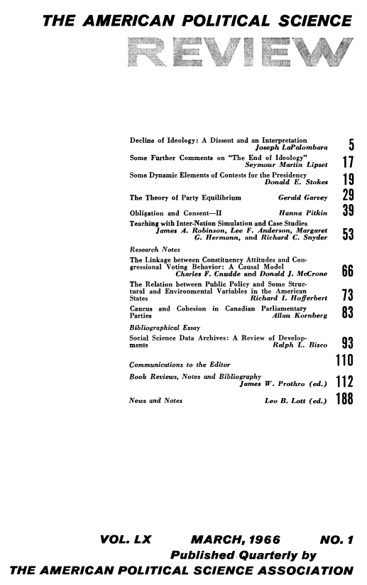
1971
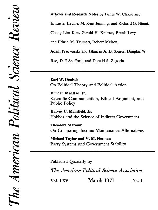
1978
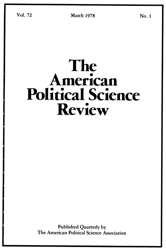
1992
2002
2009
2018
